WhatMakesaGreatWebsiteforaB2BSaaSProduct?(AndWhyMostGetItWrong)
What a B2B SaaS website actually needs to do, from an agency that builds them.
When B2B SaaS founders come to us asking for a rebuild, the reason they usually give is "it's old."
It's almost never the right reason.
Conventional wisdom says you should refresh every two to three years. Fine. But the real reason a site needs work is whether something underneath it has changed. Your product. Your buyer. Your competition. Your message. "Old" is a proxy for those things. It's not the thing itself.
For a restaurant where the menu doesn't shift much month to month, a calendar refresh is reasonable. For a B2B SaaS company, the world around you is moving fast. Features change. Priorities change. The angle you're selling on changes because a competitor just shipped something. The site probably needs to evolve more like the product does, not on a calendar.
Which raises the actual question. What does a B2B SaaS site need to do, and is yours doing it?
Here's the part that doesn't get said enough.
Most B2B SaaS sites can't be judged by you.
If you're not the user, you don't have the problem the product solves. You land, scan the hero, and think "what are you even talking about." That isn't a sign the site is bad. It's a sign you're not who it's for.
The flip side is the actual test. If you are the user, you should know in three seconds whether this thing is for you. Whether it solves a real problem. Whether the people who built it understand the work you do.
That's the only useful definition of a great B2B SaaS site I've found. It makes the right person nod. Fast.
Most don't.
What Framer gets right
We're a design agency that builds websites for clients. So when I land on framer.com, I'm exactly their ICP.
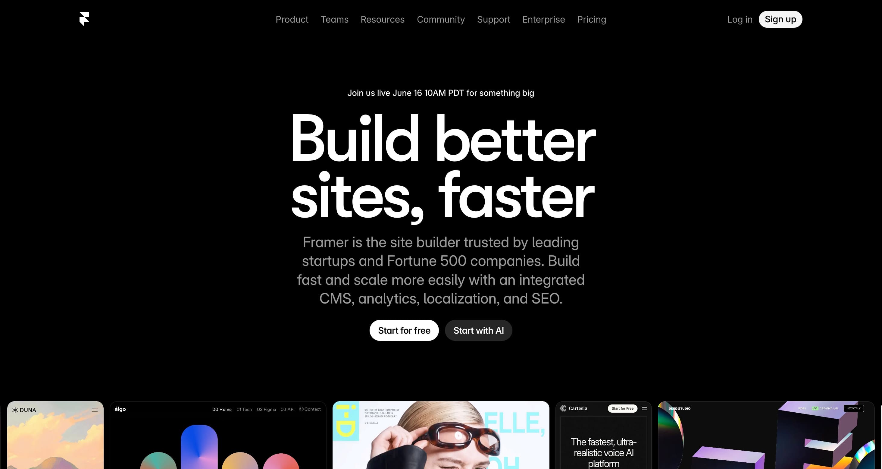
The hero says "Build better sites faster."
One line. I know what they do and why I should care.
Two value props compressed into a single sentence. Better. Faster. The two things every design team actually wants. They didn't lead with their tech stack. They didn't write a paragraph. They didn't try to be clever. They told the user, in plain language, what the product does.
Then the rest of the page does the rest of the work.
The site itself is beautifully designed. Which isn't a luxury choice. They're selling a tool to designers, and if their own marketing site looked mediocre, no designer would trust the product. The marketing site has to embody the same standard the product is selling. The buyer is sophisticated enough to notice.
They show the product in motion. Animations of real people doing real things with the tool. You get a taste before you sign up, which is exactly what designers need. Because everyone in this industry has switched tools too many times. Photoshop. Illustrator. Sketch. Figma. Framer. We don't sign up for things we can't already feel.
They show product details upfront. CMS structure. Performance stats. The stuff a sophisticated user wants to know before committing. Power users hate signing up and finding out twenty minutes later that the thing they actually need isn't there.
Then they widen the lens for a secondary audience. There's a section pointing you to a network of pro designers you can hire if design isn't your job. Quietly clever. It tells the marketer-in-a-startup who got volunteered to build the company website that they don't have to do this alone. Without diluting the message for the designer, who's the primary buyer.
The final CTA is "Design Bold. Launch Fast." Same energy as the hero. You leave the page feeling like you can do something.
That's a B2B SaaS website doing its job.
What most B2B SaaS sites get wrong
The patterns show up over and over.
1. The hero says nothing.
"The future of [category]." "Powerful, intuitive, and built for teams." "AI-native [thing]." None of these tell the actual user what the product does. If your hero could be pasted onto a competitor's site and nobody would notice, the hero is broken.
The Framer test: in one line, can the right user understand what the product does and why they'd care? If not, rewrite.
2. The page is a feature list, not a story.
The site talks about what the product is instead of what it does for the user. Feature one. Feature two. Feature three. Screenshot grid. Nowhere on the page does the buyer see themselves or their problem.
There's a line from a marketing book that stuck with me (I should look up the attribution). It says something like: go where your customers are, and answer the question they're already asking. Your features are not the question your customer is asking. The question is: can this thing solve my problem, save me time, make me look good in front of my boss. The page should answer that. Mention features as evidence, not as the headline.
3. The site doesn't embody what the product is selling.
A design tool with a mediocre site. A "speed" product with a slow site. An "AI-native" platform with a UI that looks 2019. The buyer is paying attention to whether the company can actually do what it claims, and the marketing site is the first piece of evidence.
If your product is fast, the site has to be fast. If your product is beautiful, the site has to be beautiful. If your product is technically deep, the site has to look like the team behind it could ship technical depth.
4. Forgetting that B2B has a buying committee.
Behind every user is an approval chain. The user might love the product, but they have to convince a manager. The manager has to convince finance. Finance has to check it against the budget. A great site arms the user to make that case. It gives them the bullet points, the ROI framing, the security and compliance language they'll forward to procurement.
A weak site is written for one person and forgets that one person doesn't actually have the authority to buy.
The exception is products where the user is the buyer. We've worked with a SaaS client whose product automates a piece of someone's day, saves them hours every week, and gets adopted by individual operators or in small companies where the user can just decide to use it. In that case, the site can speak directly to the user's pain, no committee. But for most B2B SaaS, that isn't the situation. The site has to do double duty: convince the user, then equip the user to convince everyone else.
The actual question to ask
Most SaaS founders ask: how do I make my website look more professional?
The better question: what does my user need to nod at, and how fast can I get them to it?
A great B2B SaaS site isn't a checklist of best practices. It's a precisely-targeted piece of communication aimed at a specific person with a specific problem. Everything on the page either earns its place by helping that person, or it shouldn't be there.
And once you've built it, treat it the way you treat the product. The product evolves. The site has to evolve with it.
If you're not sure who that person is, your website isn't the problem. The positioning is.
Ready to find out what's broken on your site?
Book a free 30-minute consultation and we'll walk through it with you. We'll tell you whether the issue is design, positioning, or something else entirely. No pitch unless we both agree it makes sense.