MELTz
Crafted the missing software piece to deploy MELTz to hospitals in Japan, helping stroke patients recover from hand paralysis.

The Mission
When people suffer a stroke, sometimes their hand becomes paralyzed, severely impacting their quality of life. The team at MELTIN was building MELTz, a pioneering neurorehabilitation device that helps patients relearn how to use their hand with robotic assistance. Our mission was to craft the robotic arm's accompanying software interface for physical therapists to guide patients during treatment.
The Outcome
We designed a cohesive and streamlined interface that complements the aesthetics of their robotic arm. A new design system was implemented to help the MELTIN team continue building new features and improving the product.
The Impact
Usability improved, reducing the set-up time to begin treatment. MELTz is now deployed in hospitals in Japan, helping people who suffered a stroke recover use of their paralyzed hand. The UI is an integral part of the product that enables physical therapists to run customized exercises safely and effectively for patients.

MELTIN, a venture company involved in R&D for cyborg technology, was engineering a new hand rehabilitation device to help patients recovering from a stroke.
Patients often lost their hand motor skills after a serious stroke. Their hands would curl up into fists that they couldn't unfurl on their own. This condition impacted their everyday lives, and physical therapy was one of the treatments available.
The team at MELTIN believed neurorehabilitation technology could expedite treatment, getting patients back to living their best lives sooner. Their new device hooks up to the affected hand and reteaches the patient to use it again.

When we first met, the team at MELTIN had a working prototype and needed to flesh out the visuals. But the lengthy onboarding made it became apparent that the overall user flow needed to be simplified. The numerous settings, options, and features, some of which were rarely used, also distracted therapists from their primary flow.
To better understand the problem, we consulted with their on-staff physical therapist, who provided valuable guidance. Busy therapists needed to set up the device and exercise plans for each patient quickly. The patient needed to feel like they were making progress in their recovery, since they were often already feeling down about their condition. We also drew insights about user pain points from usability testing with three real therapists and a patient.
Aesthetics and usability
Once the user flow had been improved in an initial round of design and implemented in development, it was time to reimagine the look and feel. Leaning into the futuristic aesthetic, we first tried a neumorphic design.
It was aesthetically pleasing, but once it was implemented by the development team, we soon realized that usability was challenging due to the device screen's brightness. The interface lacked contrast and appeared washed out, making it difficult for users to interact with.
In response, we simplified the visuals, making elements more button-like and emphasizing shadows to enhance contrast. As a result, we achieved a more intuitive interface for the therapist and patient.

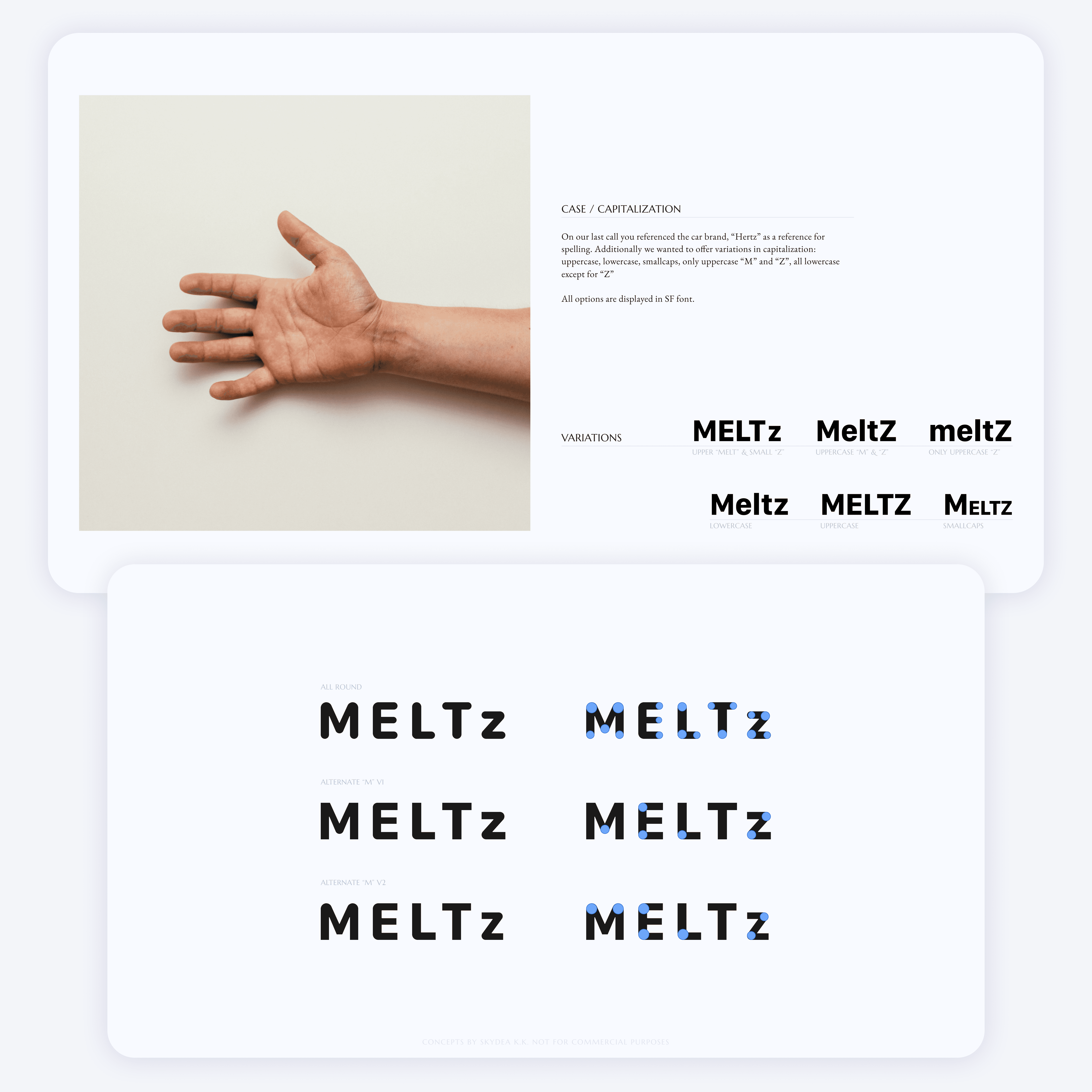
You can be in a hospital for treatment, but you don't have to feel like you're in a hospital for treatment. When we began the MELTz project, the device lacked an identity—so we were tasked with crafting a new one. The MELTIN team wanted to avoid giving it that "medical" feel. They desired to create a cutting-edge and cool experience but also one that felt friendly, safe, and calming for patients on the road to recovery. With this in mind, we collaborated with the team to develop a visual direction and logo that aligned with their vision.
Simple, safe, and friendly
We offered several ideas to help us understand the vibe they were going for, and we landed on a logo that echoed the look of Hertz, the rental car brand. Together with the MELTIN team, we crafted a visual language for MELTz to provide a warm, comforting, and even exciting rehabilitation experience.
A system for continued development
Every pioneering product is expected to improve and grow, and MELTz is no exception. We provided the MELTIN team a design sytem and guidance to help them continue to innovate and streamline the development process for future features and improvements.
And it's off to market
MELTz is now available, improving patient care for people who suffered a stroke recover the use of their hand. Visit the MELTz website to learn more.