Younode
A fresh identity for a web3 startup
Younode
A fresh identity for a web3 startup
The Mission
Younode was pivoting their business. They had recently sunsetted their namesake product, and were looking to redefine who they were as a company. Our mission was to take the Younode brand from vague to crystal clear.
The Outcome
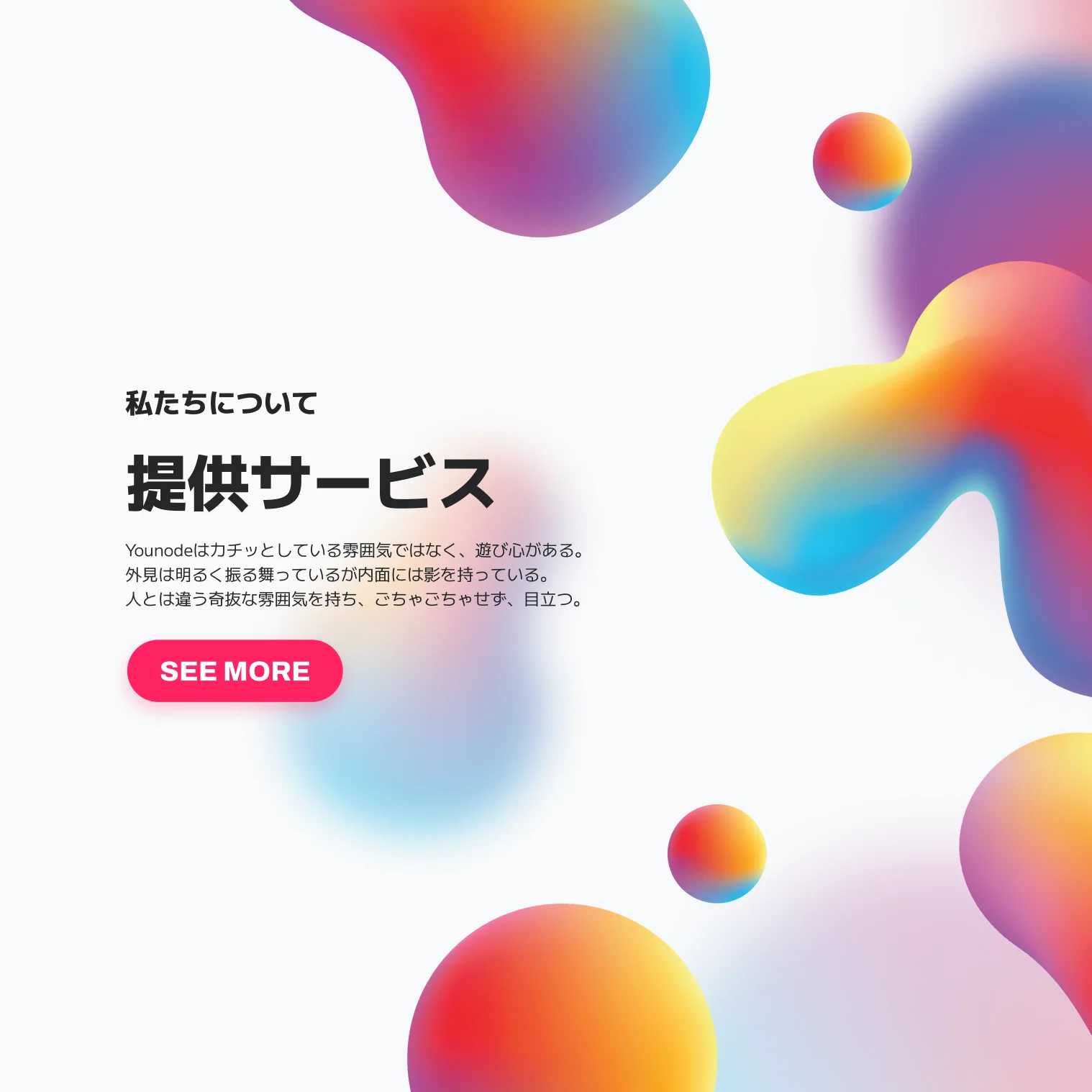
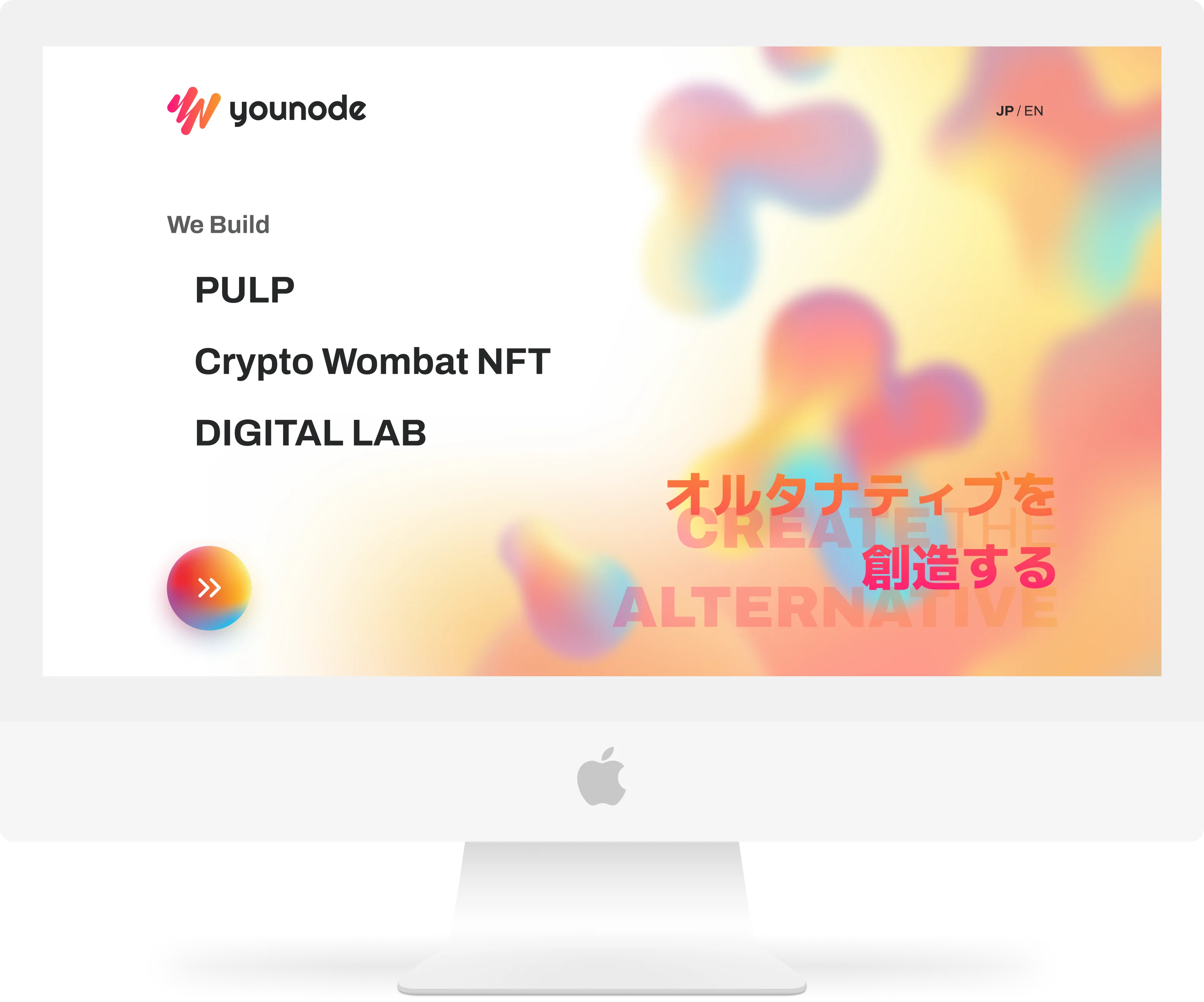
We rebuilt the visual identity from the ground up, discovering Younode's brand personality together with their founders. A new website is in the works, together with a new landing page to attract leads for their development services.
The Impact
With their new brand identity, Younode's founders are feeling far more confident that their brand speaks true to who they are, and ready to tackle new challenges.
The pivot
Younode is a Japanese startup based out of Sapporo, Hokkaido. Their first public product, also named Younode, was a password manager for the Japanese market, seeking to offer a localized solution for a product that was often only in English.
However, password managers have been around since the past decade. They came to the conclusion that other tools were sufficient, and closed it down to pivot towards other possibilities.
They took this opportunity to redefine who they were as a company.
Discovering a company's identity
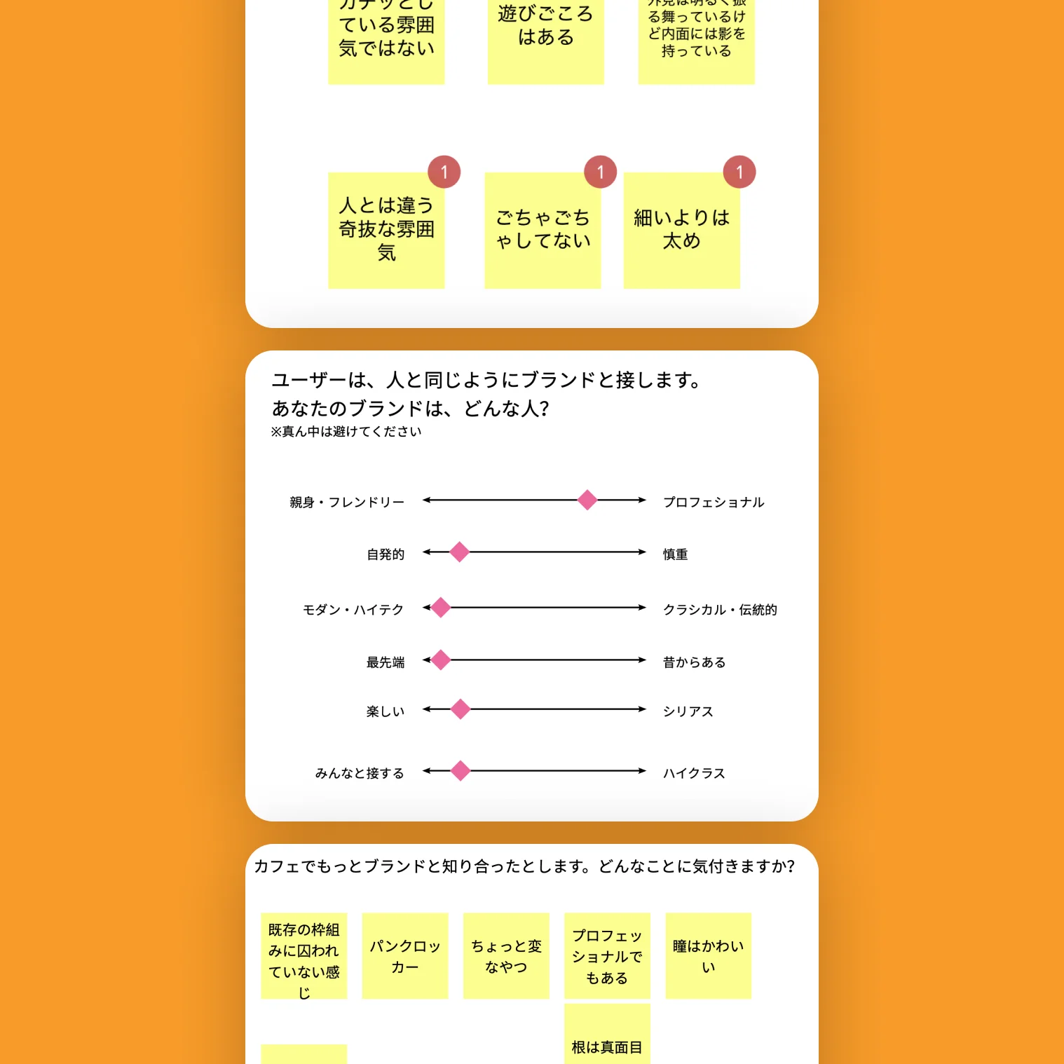
We began the project with a discovery workshop. Beginning with a brief history of their company and the motivations that got them to where they are today, we began to put to virtual paper their thoughts, which had been previously unarticulated. There were brief moments of surprise, as Younode's two leaders expressed what they hoped for its future. By the end of the session, however, they had achieved alignment about who they were as a company and where they were headed.
This is the first time we’ve been able express ourselves so clearly.
これほど違和感なく、自分たちを表現できたのは初めてです。
Visualizing the brand
After wrapping up the discovery phase, we moved on to creating stylescapes to explore possible visual directions for the brand. We began with three divergent possibilities, then narrowed and recombined ideas with each round of feedback.
A couple of iterations later, we came to a solid direction for the refreshed look and feel. One key element was an organic imperfection, which was central to their identity—the amorphous blob visuals that changed shape and size represented their company's fluidity.
Exploring logo directions
From the discovery session, three words were surfaced: informal, playful, and vulnerable. From these, we created word maps, pulling visual associations and combining concepts to come up with ideas. Aesthetically, these words evoked something round, soft, and fluid, avoiding sharp edges.
However, some of these words were pulling the brand in a different direction. "Playful" was a bit too fun, and the leaders of the company found the visuals related to it too soft and childish. It turns out the more relevant words were alternative, organic, and imperfect—which guided the rest of the visual journey.
The logo we arrived upon played with the notion of bouncing ideas between organic "nodes" or people, which were interconnected. This spoke to their focus on web3 and their creative ambitions.
Similar Projects
MELTz
Interface Design for Robot-Assisted Physical Therapy
Medical Device: UX Design, UI Design, Graphic Design, Startup
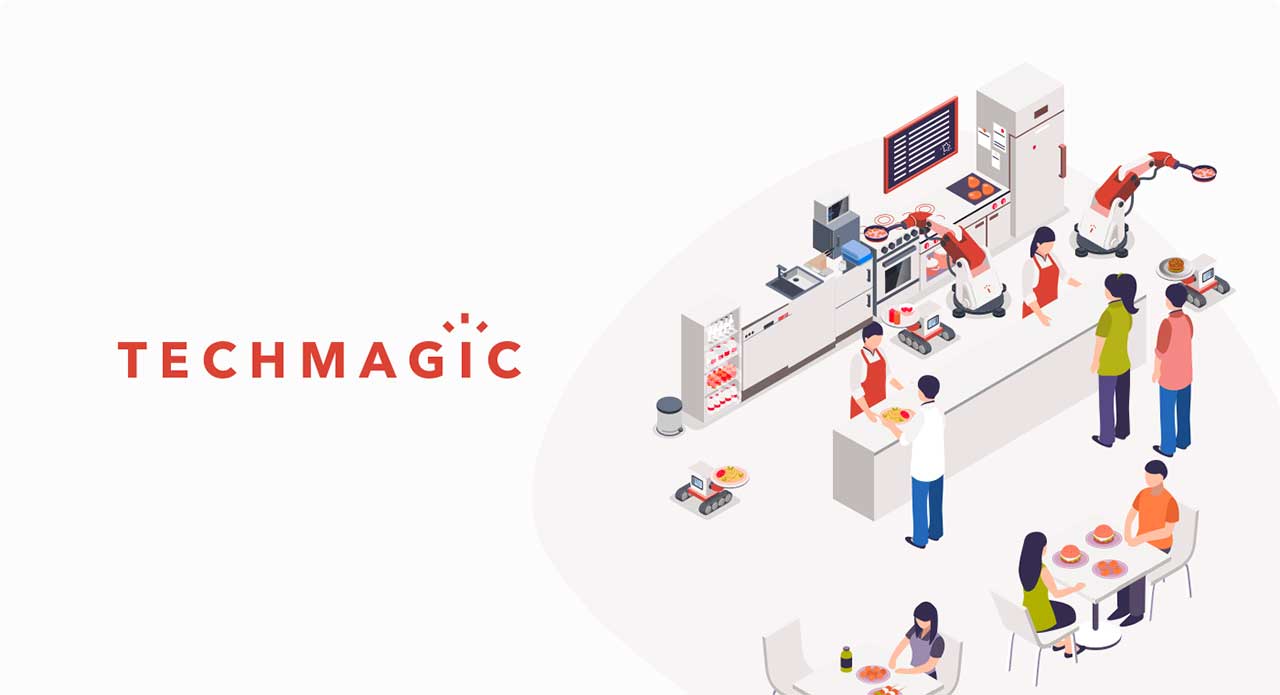
TechMagic
Branding a Nascent Food Robotics Startup
Robotics: Web Design, Branding, UX Design, UI Design, Startup