WhatDesigningforJapaneseUsersTaughtUsAboutDesigninGeneral
Japanese web design looks chaotic to Western eyes until you understand why it works. What a decade of building for Japanese users taught us about the assumptions baked into Western design thinking.
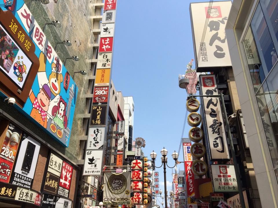
The first time most Western designers see a Japanese website, the reaction is some version of confusion. Dense text, multiple things competing for attention, navigation that seems to go everywhere at once. By Western standards, it looks like a mess.
But messy and wrong are different things. Confusing the two is one of the most common mistakes you can make when you're designing for a market that doesn't share your defaults.
I know this from experience. My first job out of college was at Rakuten, working on the homepage of Rakuten Ichiba, their main marketplace. At the time, it was probably the most quintessentially busy Japanese website you could find. Dense, layered, a lot going on. I spent real time there pushing for a cleaner direction, removing unnecessary drop shadows, stripping back skeuomorphism where I could. It's noticeably cleaner now than it was back then. But more than anything, working there taught me why the density existed in the first place. That was the more useful lesson.
Chirashi culture
Japan has a long tradition of chirashi, the dense promotional flyers that pack a huge amount of information into a small space. Walk around Tokyo and you see the same logic scaled up to an entire city: flashing signs, layered text, visual information everywhere. This isn't a failure of restraint. It's a communication culture where density signals effort and completeness.
Japanese users are used to receiving a lot of information at once, and kanji makes this more practical than it looks. A single character conveys meaning that would take several English words to express. What feels overwhelming in Latin script is often quite readable in Japanese, because the characters are doing more work per unit of space.
Familiarity as trust
One of the most revealing things I saw at Rakuten was an A/B test on the mobile homepage. We tried removing item description text from product listings. The reasoning made sense: a lot of that text was brackets, stars, and sale copy that had nothing to do with the actual product. Removing it should have felt cleaner.
Conversion dropped enough that we had to call off the test.
What that told us was that users weren't reading the text the way we assumed. It was acting as a familiarity signal. A visual confirmation that the page was behaving the way they expected. Removing it, even when it wasn't adding real information, introduced enough uncertainty to make people hesitate. They'd looked at those items before. They still needed the text there to feel comfortable clicking.
Familiarity reduces friction in ways that are easy to underestimate if you come from a design culture where minimalism is itself a trust signal.
What Japanese business sites need to include
In B2B and corporate contexts, the information Japanese users expect to find is quite different from Western conventions. A CEO greeting page is standard on Japanese corporate sites, not because it's decorative, but because it functions as a formal introduction. In Japanese business culture, meetings begin with introductions. A corporate website that skips this is quietly skipping a step that signals whether a company understands how relationships work here.
The same goes for company details: address, founding date, capital, number of employees, representative director. In Western web design, this information is usually buried or left out entirely. In Japan, its absence reads as a credibility problem. It raises the question of whether you're a real company worth taking seriously.
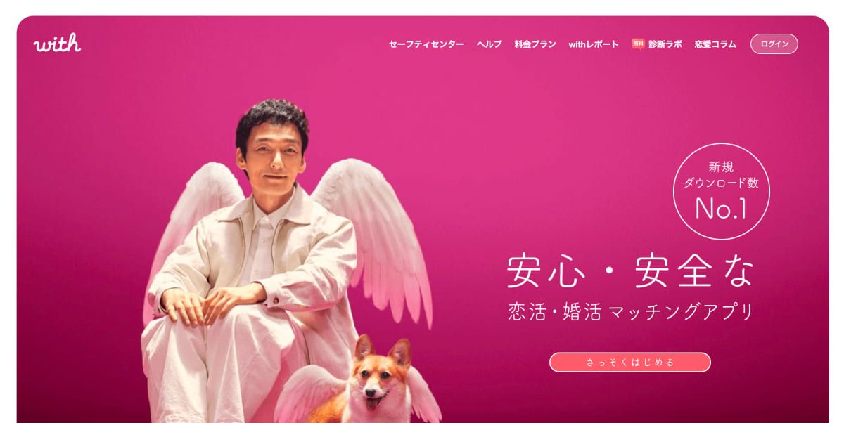
Japan loves a familiar face
Celebrity and mascot endorsements are everywhere in Japanese marketing, and it connects to something broader about how people here engage with media. According to Japan's Ministry of Internal Affairs and Communications, television has remained one of the top two media by daily usage time for over a decade — with adults in their 50s averaging over 160 minutes of TV per day, and those in their 60s averaging over 244 minutes. In much of the West, audiences have shifted to streaming and social media as their main source of entertainment. In Japan, broadcast TV still holds a cultural weight that most Western markets have moved away from. When a familiar face endorses something here, it's a big deal.
Things are changing, just not in the way you might expect
Japanese web design has been getting cleaner over the past several years. But it's not a wholesale shift toward Western minimalism. What's actually happening is more specific: the long descriptive text is getting smaller and moving lower on the page, while visuals take up more space at the top. The information is still there. The hierarchy is just adjusting.
This matters for companies entering the Japanese market. Taking a spare, single-CTA site that works well for a US SaaS product and presenting it to a Japanese B2B audience is likely to feel incomplete rather than clean. The adaptation isn't about making things busier. It's about knowing which signals communicate trust to this audience and making sure they're actually there.
Crossing cultures
Working across design cultures teaches you something hard to learn any other way: most design rules are actually design defaults. Sensible starting points, shaped by the context they were built in, that get mistaken for universal principles when you've only ever worked in one market.
Every instinct that feels obvious in Western design — whitespace equals confidence, simplicity equals trust, one CTA per page — is a learned assumption. Learning that another market does it differently, and understanding why, is one of the fastest ways to understand what you're actually doing when you make any design decision.
After years of working across both markets, that category of learned assumptions is bigger than most designers realize.